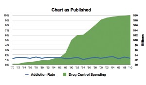
Fig. 1: “A Chart That Says the War on Drugs
Isn’t Working,” as published, with two y-axes.
(Click each image for a larger view.)
By any measure, the War on Drugs has been and continues to be a failure. Although an ever-increasing number of political figures is willing to admit this, the argument has not been presented to the public as clearly as it might.
Recently, for example, salon.com drew attention to a chart reproduced in theatlanticwire.com. The graphic (Fig. 1), which I’ve recreated here for easier comparison*, purports to show how the 40-year-old “war” has been, according to salon.com, “an extremely expensive Huge Government boondoggle.” While annual federal spending to “control” drugs has increased 20-fold during that period, the national rate of addiction has remained largely unchanged at between 1% and 2% of the U.S. population.

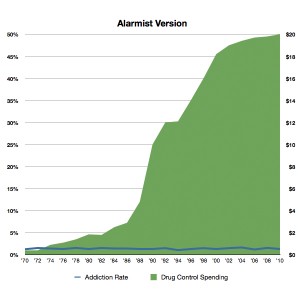
Fig. 2: This chart exaggerates the disparity between the two sets of data and gives the impression of an even greater degree of waste.
Figure 1 shows that relationship, sort of, but it misleads the viewer. How? By distorting the relationship between the two sets of numbers, using different units of measurement. Instead of comparing percentages to percentages or dollars to dollars, the published chart “compares” percentages to dollars, each according to its own arbitrary scale, as shown on the left and right y-axes, respectively.
To see how pernicious a practice this is, consider how manipulating the chart’s two y-axes scales can reinforce contradictory conclusions.
An “Alarmist Version” of the original chart (Fig. 2) heightens the suggestion that the War on Drugs has been tremendously wasteful.

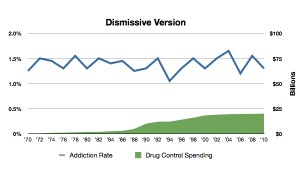
Fig. 3: This chart minimizes the relationship between the two sets of data, suggesting ineffectiveness perhaps, but negligible waste.
A “Dismissive Version” (Fig. 3), on the other hand, suggests that the War on Drugs has been hardly wasteful at all.
I’m sure the original chart was designed in good faith. The fact remains, however, that it distorts the data it supposedly illustrates, a inherent flaw of charts with two y-axes scales. What makes the published chart especially disappointing is that it carelessly assumes that its depiction is value-free.

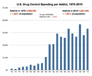
Fig. 4: This chart shows a large increase in control dollars spent per addict over a time when the addiction rate remained essentially flat.
What would be a better way of expressing these facts, one without bias (inasmuch as this is possible)?
Consider “U.S. Drug Control Spending per Addict, 1970-2010” (Fig. 4). By converting the two sets of data to a common unit of measurement, control dollars spent per addict, this chart more accuratetly shows the growth in spending during a time when the rate of addiction remained roughly constant. Not as dramatic as the preceding versions certainly, but considerably more honest.
Can you design a different chart to show this information with minimal bias? What dual y-axes charts have you seen lately?
* Figures 1-4 are based on a close reading of the original theatlanticwire.com chart instead of the actual numbers, which weren’t readily available. Theatlanticwire.com identifies the sources as the U.S. Department of Health and Human Services and the International Centre for Science in Drug Policy by way of documentary filmmaker Matt Groff.
Return

