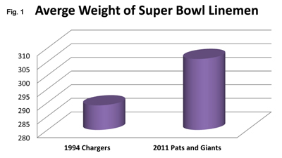
Statistical graphics are commonly used to “bulk up” news stories and add a sense of scientific authority to their claims. However, most charts in the popular media are junk–hard to read and misleading at the same time. This one (fig. 1), for example, appeared widely after the suicide of former San Diego Chargers linebacker Junior Seau.

The tragedy prompted speculation about how a career’s worth of head injuries caused by collisions against today’s larger opponents might’ve contributed to Seau’s death. But the chart is awful. What are the two average weights supposed to be–286 or 295? 303 or 310?

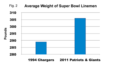
The first step to improving this chart (after fixing the typo in the title) is to dump the fake 3-D effect (fig. 2). Now you can clearly see that the correct values are 289 and 306.
The 2-D chart is still deceiving, however, because it suggests that the average 2011 player was nearly three times the size of the average 1994 player.
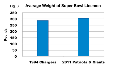
 Fixing this is simply a matter of basing the chart’s scale on zero (fig. 3). This makes it obvious that the average 2011 player was roughly 6% bigger than his 1994 counterpart.
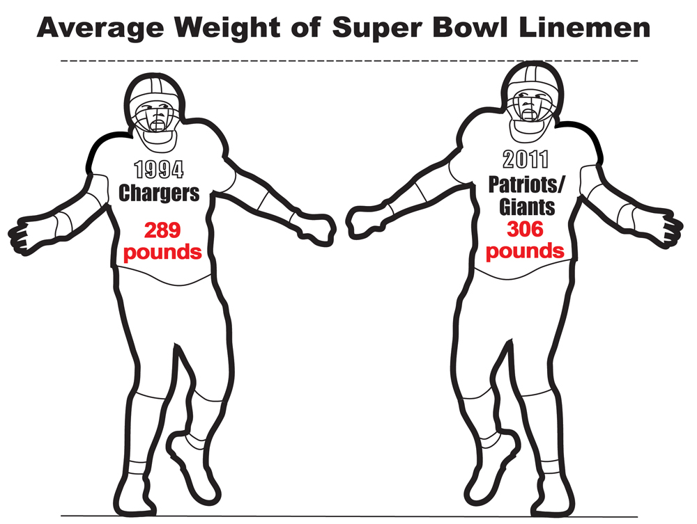
This redesigned chart is now accurate and easy to read, which should be the absolute minimum standard for statistical graphics. It’s still a bit dry, but any attempt to “prettify” the numbers should be careful to maintain this standard. Here’s what an accurate, legible, more visually interesting statistical graphic might look like–don’t you agree?


excellent examples of misleading charts and graphs…not that the media would ever exaggerate to add emphasis, right? I do, however, like 3-D, kind of adds depth, if not perception!