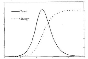
This chart recently appeared in the news. Supposedly it shows the destructive potential of a nuclear weapon as calculated by some nameless Iranian scientist.
Turns out it’s a crude copy of what’s called a “normal distribution curve,” commonly found in textbooks and online. In this case, the lines show the relationship of power and energy output over time.
However, the shapes of the two overlapping curves — one brief and limited and the other sustained and open-ended — suggest other associations. What additional relationships might this chart depict?
- The payoff of sex versus love?
- The heartfelt significance of a gift card versus a handmade present?
- The pain of stepping barefoot on a Lego in the dark versus losing an adolescent to independence?
What interpretations can you assign to the chart above?
